
Google Stitch – Phần 3 : Thực chiến tạo design cho Mobile App
TutorialsContents
Chào mừng bạn đến với Fx Studio. Tiếp nối Phần 1 và Phần 2, hôm nay mình sẽ đi vào phần mà nhiều bạn chờ đợi nhất: thực chiến thiết kế một Mobile App hoàn chỉnh bằng Google Stitch.
Nếu mọi việc đã ổn rồi, thì …
Bắt đầu thôi!
Đôi lời tản mạn
Ở hai phần trước, bạn đã biết Google Stitch là gì, cách dùng ra sao, và quan trọng nhất – cách viết prompt hiệu quả với framework Zoom-Out-Zoom-In. Lý thuyết thì đã đủ. Vấn đề là: áp dụng vào thực tế như thế nào?
Chính vì vậy, trong bài viết này, mình sẽ cầm tay chỉ việc – từ lúc xác định ý tưởng app, viết prompt đầu tiên, generate UI, refine từng bước, cho đến khi có một bộ design hoàn chỉnh sẵn sàng export sang Figma hoặc code.
Toàn bộ quá trình sẽ áp dụng các kỹ thuật prompt đã học ở Phần 2. Nhờ đó, bạn sẽ thấy rõ sự khác biệt giữa “viết prompt bừa” và “viết prompt có hệ thống”.
Đề bài: Thiết kế app gì?
Trước khi bắt tay vào làm, mình cần chọn một ý tưởng app đủ thực tế để minh họa. Sau khi cân nhắc, mình chọn thiết kế một app luyện tập trí nhớ (Memory Training App). Lý do là:
- App brain training là chủ đề thú vị, dễ hình dung và gần gũi với mọi người.
- Có nhiều loại màn hình khác nhau: home, danh sách bài tập, gameplay, kết quả, profile – đủ để minh họa workflow đa dạng.
- Phong cách trẻ trung, pastel rất phù hợp để thấy rõ cách dùng tính từ và visual direction trong prompt.
- Đủ phức tạp để minh họa workflow thực tế, nhưng không quá phức tạp đến mức mất tập trung.
Cụ thể, app sẽ có 5 màn hình chính:
1. Home – Màn hình chính với daily challenge và tổng quan tiến độ
2. Exercise List – Danh sách các bài tập trí nhớ theo category
3. Gameplay – Màn hình chơi game (ví dụ: lật thẻ nhớ)
4. Result – Màn hình kết quả sau khi hoàn thành bài tập
5. Profile & Stats – Thống kê cá nhân và streak
Lưu ý: Trong bài này, mình sẽ tập trung hướng dẫn chi tiết 3 màn hình đầu tiên (Home, Exercise List, Gameplay). Hai màn hình còn lại (Result và Profile & Stats), mình sẽ để các bạn tự thực hành. Đây cũng là cách tốt nhất để bạn áp dụng những gì đã học.
Bước 1: Thiết lập bối cảnh chung
Chọn cấu hình trên Stitch
Trước khi viết prompt, hãy thiết lập đúng cấu hình trên giao diện Google Stitch:
- Layout: chọn App (vì chúng ta đang thiết kế mobile app)
- Model: chọn 3 Flash (model mặc định, đủ tốt cho hầu hết nhu cầu và hỗ trợ export Figma)
Viết prompt khởi đầu – Thiết lập context
Theo framework Zoom-Out-Zoom-In, bước đầu tiên là cho Stitch hiểu bức tranh tổng thể. Mình sẽ viết một prompt mô tả chung về app trước khi đi vào từng màn hình cụ thể.
Prompt:
"Design a mobile memory training app for iOS.
Target users: students and young adults aged 16–30 who want to improve their memory, focus, and cognitive skills through fun daily exercises.
App personality: playful, friendly, and encouraging – like a supportive coach, not a strict teacher.
Visual style:
– Soft pastel color palette with warm, inviting tones – think lavender, mint green, and peach as main colors.
– Backgrounds: warm white or very light cream.
– Shapes: rounded, smooth corners everywhere – buttons, cards, icons.
– Icons: cute, illustrative style – not flat or corporate.
– Typography: friendly rounded sans-serif font.
The app has 5 main screens: Home, Exercise List, Gameplay, Result, and Profile & Stats.
Start with the Home screen."
Prompt này bao gồm đầy đủ các lớp thông tin từ framework:
- Context: memory training app, iOS, students và young adults
- Visual Direction: playful, friendly, encouraging, soft pastel
- Constraints: tone màu pastel (lavender, mint, peach), rounded shapes, illustrative icons
- Screen Goal: bắt đầu với Home screen
Tại sao không dùng mã màu cụ thể?
Ở đây, mình chủ đích không chỉ định mã màu cụ thể (hex code). Thay vào đó, mình chỉ mô tả tone chung: lavender, mint green, peach. Lý do là Stitch – cũng giống bất kỳ AI nào – cần không gian để sáng tạo. Nếu bạn “khóa chặt” mọi thứ bằng mã màu, kết quả có thể cứng nhắc và thiếu sự hài hòa tự nhiên. Hãy để AI đề xuất trước, rồi bạn tinh chỉnh sau nếu cần.
Ngoài ra, bạn cũng thấy prompt được ngắt ý rõ ràng – mỗi khía cạnh (target user, personality, visual style) đều nằm trên dòng riêng. Cách viết này giúp AI parse thông tin chính xác hơn so với viết dồn thành một đoạn văn dài. Hãy nghĩ rằng bạn đang viết cho AI đọc, không phải viết văn.
Mẹo: Chỉ nên chỉ định mã màu cụ thể khi bạn đã có brand guideline rõ ràng hoặc khi kết quả AI chọn màu không đúng ý. Trong giai đoạn ideation, mô tả tone bằng tính từ (soft, warm, muted) thường cho kết quả tự nhiên hơn.
Bước 2: Thiết kế Home Screen
Generate lần đầu
Sau khi nhập prompt ở Bước 1 và nhấn Generate, Stitch sẽ tạo ra một hoặc nhiều variant cho Home screen. Thông thường, kết quả đầu tiên đã khá gần với mong đợi – nhưng chưa hoàn hảo.
Hãy quan sát kết quả và đánh giá theo các tiêu chí:
- Layout tổng thể có hợp lý không?
- Phong cách pastel có đúng mood không? Màu sắc có quá đậm hay quá nhạt?
- Hierarchy thông tin đã đúng chưa? (daily challenge nên nổi bật nhất)
- Có thiếu component nào quan trọng không?
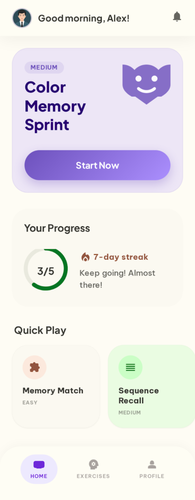
Kết quả màn hình Home sau khi chạy xong Prompt khởi đầu – Thiết lập Context
Refine – Bổ sung chi tiết layout
Nếu kết quả ban đầu thiếu một số component hoặc layout chưa đúng ý, hãy refine bằng prompt riêng. Nhớ nguyên tắc vàng: mỗi lần chỉ một thay đổi.
Prompt refine 1 – Bổ sung cấu trúc chi tiết:
"Update the Home screen layout with the following structure from top to bottom:
1. Header:
– A friendly greeting text: 'Good morning, Alex!'
– A small circular user avatar on the left.
– A notification bell icon on the right.
2. Daily Challenge card (primary focus of the screen):
– A playful brain illustration on the right side of the card.
– Challenge title in bold (e.g., 'Color Memory Sprint').
– A small difficulty badge (e.g., 'Medium').
– A large, prominent 'Start Now' button at the bottom of the card.
3. Your Progress section:
– A circular progress ring showing today's goal (e.g., '3/5 exercises completed').
– A flame icon with the current streak count (e.g., '7-day streak').
– A short motivational text (e.g., 'Keep going! Almost there!').
4. Quick Play section:
– A section title: 'Quick Play'.
– 3 horizontal scrollable game category cards: Memory Match, Sequence Recall, Pattern Recognition.
– Each card shows a cute icon, game name, and a difficulty tag."
Chờ kết quả → Kiểm tra → Screenshot nếu hài lòng.
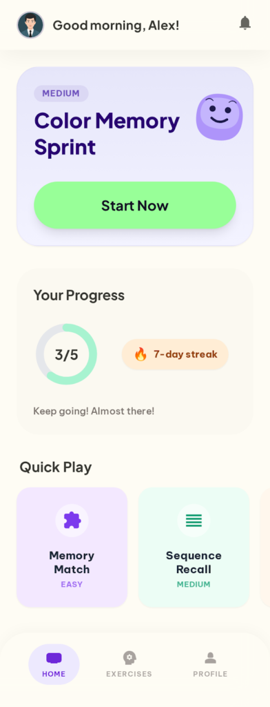
Kết quả màn hình Home sau khi chạy xong Prompt refine 1 – Bổ sung cấu trúc chi tiết
Sau khi layout đã ổn, tiếp tục tinh chỉnh phần visual cho đúng mood pastel:
Prompt refine 2 – Tinh chỉnh Daily Challenge card:
"Adjust the Daily Challenge card:
– Background: a soft pastel gradient using the lavender tone, transitioning from slightly darker at the top to lighter at the bottom.
– The brain illustration: cute and cartoon-style, placed on the right side, slightly overlapping the card edge for a dynamic feel.
– The 'Start Now' button: rounded-full shape, fresh mint green tone, dark text, large enough to be the most tappable element on the screen."
Chờ kết quả → Screenshot.
Prompt refine 3 – Tinh chỉnh Your Progress section:
"Adjust the Your Progress section:
– Progress ring: use a gentle mint tone for the filled portion, light gray for the unfilled. The ring should be thick enough to be easily readable at a glance.
– Streak counter: displayed as a small badge with a warm peach background, a fire emoji on the left, and the streak number in bold.
– Motivational text: placed below the progress ring, muted gray color, slightly smaller font than body text.
– Layout: place the progress ring and streak counter side by side horizontally, not stacked vertically."
Chờ kết quả → Screenshot.
Hoàn thiện Quick Play cards
Prompt refine 4 – Tinh chỉnh Quick Play cards:
"Adjust the Quick Play category cards:
– Each card has a distinct soft pastel background:
- Memory Match → light lavender tone.
- Sequence Recall → light mint tone.
- Pattern Recognition → light peach tone.
– Card content:
- A cute icon centered at the top.
- Game name in bold below the icon.
- A small rounded difficulty tag at the bottom (e.g., 'Easy', 'Medium').
– Card style: generously rounded corners (about 20px), very subtle shadow for depth, consistent spacing between cards."
Chờ kết quả → Screenshot.
Quan trọng: Sau mỗi bước refine thành công, hãy chụp screenshot ngay. Đây là bài học xương máu từ Phần 2 – nếu Stitch lỡ regenerate layout ở bước tiếp theo, bạn vẫn có bản backup.
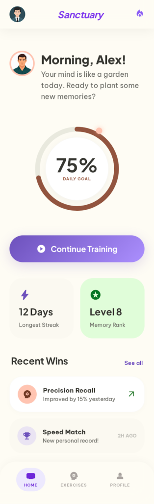
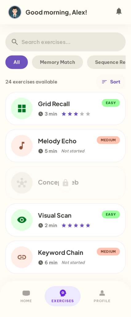
Kết quả Home Screen
Sau khoảng 4–5 lần refine, bạn sẽ có một Home screen khá hoàn chỉnh với:
Kết quả màn hình Home bản final sau khi chạy xong các prompt refine
- Header có greeting thân thiện và avatar
- Daily Challenge card nổi bật với illustration và CTA rõ ràng
- Progress section hiển thị tiến độ hôm nay và streak
- Quick Play section với các category cards có phong cách pastel riêng biệt
Tổng thời gian: khoảng 5–10 phút, bao gồm cả thời gian chờ generate.
Bước 3: Thiết kế Exercise List
Tạo màn hình mới trong cùng project
Khi đã hoàn thành Home screen, bạn tiếp tục thiết kế màn hình tiếp theo. Vì vẫn ở trong cùng project, Stitch sẽ giữ được context từ các prompt trước.
Viết prompt cho Exercise List
Dưới đây là prompt đầy đủ cho màn hình Exercise List. Prompt được chia rõ thành 2 phần: phần trên là search/filter, phần dưới là card list với các trạng thái khác nhau. Khi copy prompt, hãy bỏ các dòng chú thích tiếng Việt (--- PHẦN 1 ---, --- PHẦN 2 ---) trước khi paste vào Stitch:
"Now design the Exercise List screen for this memory training app.

Screen goal: Show all available memory exercises organized by category, so users can browse, filter, and pick one to play.

Layout from top to bottom:

--- PHẦN 1: SEARCH & FILTER ---

1. Search bar:
– Rounded input field with a search icon on the left.
– Placeholder text: 'Search exercises...'
– Light gray background, subtle border.

2. Category filter row:
– Horizontal scrollable pills: All, Memory Match, Sequence Recall, Pattern Recognition, Word Recall, Number Memory.
– Selected pill: solid pastel lavender background, white text.
– Unselected pills: very light gray background, dark text.
– All pills: fully rounded corners.

3. Section header:
– Left: text showing count (e.g., '24 exercises available') in muted gray.
– Right: a small sort button with sort icon (options: Popular, Newest, Difficulty).

--- PHẦN 2: CARD LIST & STATES ---

4. Exercise card list (vertical scrollable):
– Each card contains:
  • Left: a cute illustrative icon representing the exercise type (circular background).
  • Middle: exercise name (bold, 16px) on the first line. Short one-line description below (muted gray, 14px).
  • Right top: difficulty badge as a small pill – Easy (soft mint), Medium (soft peach), Hard (soft coral).
  • Right bottom: estimated time (e.g., '3 min') in small muted text.
– Card states:
  • Unlocked + completed: show a small star rating (e.g., 3/5 stars filled) below the difficulty badge.
  • Unlocked + not started: no star rating, badge shows normally.
  • Locked: entire card appears slightly faded/transparent, small lock icon overlay on the top-right corner.
– Card style: white background, subtle pastel-tinted border, comfortable vertical padding (16px), thin divider line between cards.

Keep the same soft pastel visual style as the Home screen."
Phân tích prompt Exercise List
Prompt này áp dụng đầy đủ framework:
- Screen Goal: xem tất cả bài tập, lọc theo category
- Layout & Hierarchy: mô tả từ trên xuống (search → filter → header → list)
- Visual Direction: giữ nguyên style pastel từ Home screen
- Constraints: chi tiết cụ thể cho mỗi card, 3 trạng thái khác nhau
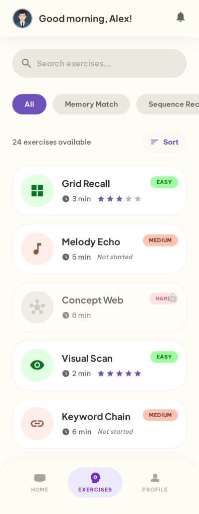
Kết quả màn hình Exercise List sau khi chạy xong prompt khởi tạo
Refine Exercise List
Vì prompt chính đã khá chi tiết nhờ cách ngắt ý rõ ràng, bạn có thể chỉ cần 1–2 bước refine nhỏ:
Prompt refine 1 – Tinh chỉnh trạng thái locked:
"Adjust the locked exercise cards:
– The lock icon should be a small padlock, placed as an overlay at the center of the card (not just the corner).
– The entire card opacity should be about 40-50% – clearly different from unlocked cards.
– Remove the difficulty badge and time estimate on locked cards – only show the exercise name and the lock icon."
Chờ kết quả → Screenshot.
Prompt refine 2 – Tinh chỉnh spacing tổng thể:
"Adjust the overall spacing of the Exercise List screen:
– Add 16px horizontal padding from both screen edges for all content.
– The gap between the search bar and the filter row should be 12px.
– The gap between the filter row and the section header should be 16px.
– The gap between the section header and the first card should be 8px.
– Each card should have 12px gap from the next card."
Chờ kết quả → Screenshot.
Kết quả màn hình Exercise List bản final sau khi chạy xong các prompt refine
Mẹo: Khi thiết kế danh sách, hãy luôn mô tả rõ trạng thái khác nhau (locked/unlocked, completed/not started). Nhờ đó, Stitch sẽ tạo ra visual cho cả hai trạng thái, giúp design trông thực tế hơn.
Bước 4: Thiết kế Gameplay Screen
Tạo màn hình game lật thẻ nhớ
Màn hình Gameplay là phần thú vị nhất – đây là nơi người dùng thực sự tương tác với bài tập trí nhớ. Mình sẽ chọn game Memory Match (lật thẻ tìm cặp) để minh họa vì nó trực quan và dễ hình dung.
Viết prompt cho Gameplay Screen
Đây là prompt dài nhất trong cả bài vì Gameplay screen có nhiều component. Tuy nhiên, mình vẫn gộp toàn bộ vào một prompt duy nhất – chỉ ngắt ý rõ ràng theo 4 khu vực trên màn hình. Khi copy prompt, hãy bỏ các dòng chú thích tiếng Việt (--- PHẦN 1 ---, --- PHẦN 2 ---) trước khi paste vào Stitch:
"Design the Gameplay screen for a Memory Match card-flipping game.

Screen goal: The player flips cards to find matching pairs. The screen should feel focused and immersive, but still friendly and encouraging – not stressful.

Layout from top to bottom:

--- PHẦN 1: HEADER & STATUS ---

1. Header bar:
– Left: a back arrow button to return to the previous screen.
– Center: game name 'Memory Match' in medium-bold text.
– Right: a pause button (pause icon).

2. Status bar (game stats):
– A row of small pills on a light cream background with rounded corners.
– Each pill has a tiny icon on the left and a value on the right:
  • Level indicator (e.g., 'Level 3') – neutral background.
  • Move counter (e.g., '12 moves') – neutral background.
  • Countdown timer (e.g., '01:45') – warm peach pastel background, slightly larger than other pills to draw attention.
  • Pairs found counter (e.g., '3/6 pairs') – neutral background.

--- PHẦN 2: CARD GRID & ACTION BAR ---

3. Card grid (main game area – takes up most of the screen):
– A 4 columns × 3 rows grid of square cards with consistent 10px spacing.
– Three card states:
  • Face-down (majority of cards): soft lavender pastel background, centered question mark icon in a slightly darker lavender tone, playful rounded font style for the question mark.
  • Face-up (2 cards currently flipped by the player): white background, colorful cute icon in the center (e.g., two matching star icons), very subtle glow or highlight border to indicate these are the active/selected cards.
  • Matched (1 pair already found): light mint pastel background, small green checkmark in the top-right corner, slightly reduced opacity (about 70%) to indicate completion, very subtle sparkle/confetti decoration around the card.
– All cards: rounded corners (12px), subtle shadow for a tactile 3D card feel.

4. Bottom action bar:
– Two pill-shaped buttons placed side by side with equal width:
  • Hint button: soft warm yellow background, lightbulb icon on the left, text 'Hint', small circular badge at top-right showing remaining count (e.g., '2') in soft coral tone.
  • Restart button: light gray background, circular arrow icon on the left, text 'Restart'.
– Both buttons centered horizontally with 24px padding from screen edges.
– Bottom padding: at least 34px for iOS safe area.

Keep the same soft pastel color palette throughout."
Nhờ cách ngắt ý theo từng khu vực (header → status → grid → bottom) và mô tả rõ từng card state, Stitch sẽ hiểu cấu trúc chính xác hơn rất nhiều so với việc viết dồn thành một đoạn văn. Các dòng --- PHẦN --- chỉ là chú thích giúp bạn dễ theo dõi bố cục prompt – nhớ bỏ chúng trước khi paste vào Stitch.
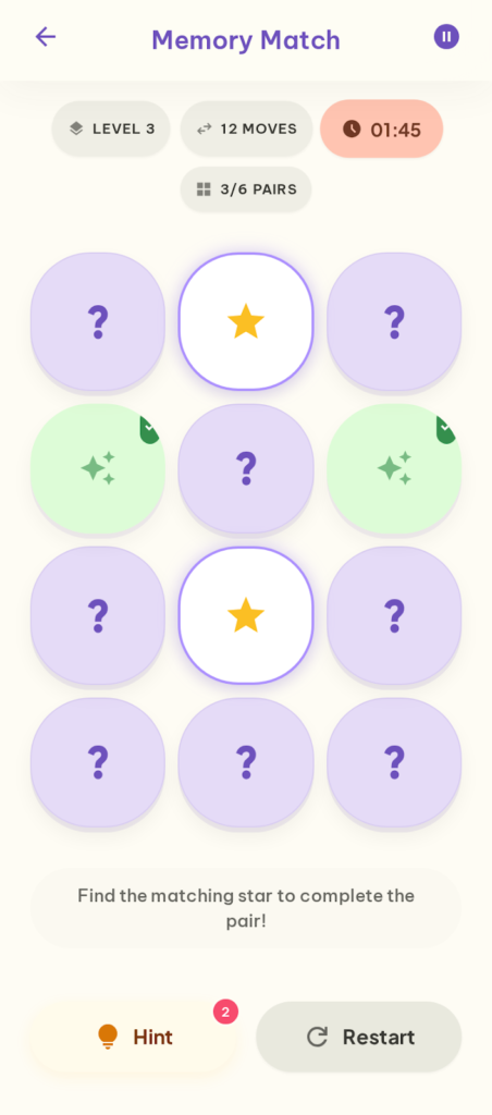
Kết quả màn hình Gameplay sau khi chạy xong prompt khởi tạo
Refine Gameplay Screen – Card grid và status bar
Prompt refine 1 – Tinh chỉnh card grid:
"Adjust the card grid:
– Increase the spacing between cards to 12px so each card feels like a clearly separate, tappable element.
– The question mark on face-down cards: use a playful, bouncy font style – think bubbly and fun, not sharp or serious.
– Ensure the grid is vertically centered in the available space between the status bar and the bottom action bar.
– Cards should be perfectly square (equal width and height)."
Chờ kết quả → Screenshot.
Prompt refine 2 – Tinh chỉnh status bar:
"Adjust the status bar:
– All stat pills should be the same height for clean visual alignment.
– The timer pill: make it noticeably wider than the others, use a bolder font weight for the countdown number, add a small clock icon.
– Reduce the status bar's vertical padding so it doesn't take too much space away from the card grid – the grid should be the hero of this screen."
Chờ kết quả → Screenshot.
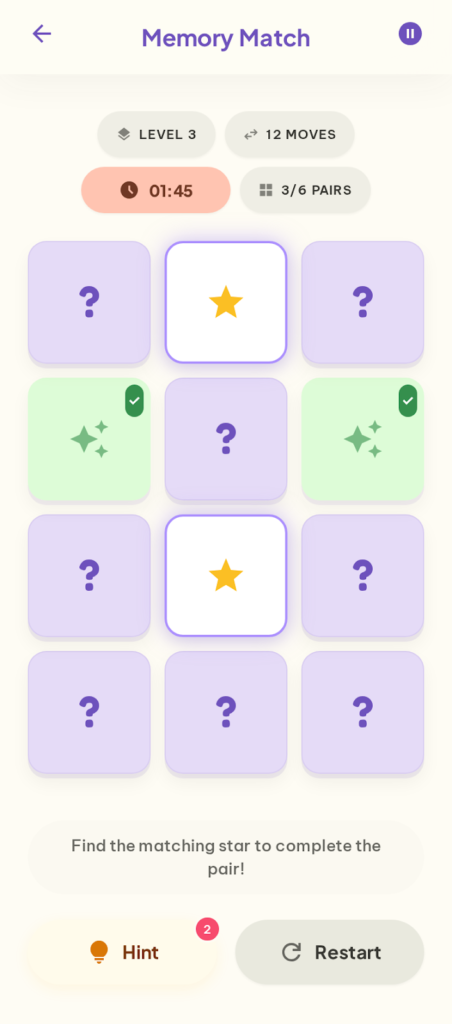
Kết quả màn hình Gameplay bản final sau khi chạy xong các prompt refine
Lưu ý: Stitch tạo ra UI tĩnh – nó không render animation thực tế. Tuy nhiên, việc mô tả hiệu ứng (confetti, glow) trong prompt giúp Stitch tạo ra visual hints gợi ý animation. Phần animation thực tế sẽ được xử lý trong code.
Bước 5: Nối màn hình thành Prototype
Sử dụng tính năng Prototypes
Sau khi đã có 3 màn hình (hoặc nhiều hơn), bạn có thể sử dụng tính năng Prototypes của Google Stitch để nối chúng lại thành một user flow tương tác.
Như đã giới thiệu ở Phần 1, tính năng Prototypes cho phép bạn liên kết các màn hình với nhau.
Prompt để tạo prototype:
"Create a prototype connecting the Home, Exercise List, and Gameplay screens with the following user flows:
Flow 1 – Daily Challenge shortcut:
– On Home, tapping the 'Start Now' button on the Daily Challenge card → navigates directly to the Gameplay screen.
Flow 2 – Browse and play:
– On Home, tapping any Quick Play category card → navigates to the Exercise List screen, filtered by that category.
– On Exercise List, tapping any unlocked exercise card → navigates to the Gameplay screen for that exercise.
– On Exercise List, tapping a locked exercise card → shows a small tooltip or overlay saying 'Complete previous exercises to unlock'.
Flow 3 – Navigation back:
– On Gameplay, tapping the back arrow → returns to the previous screen (either Home or Exercise List, depending on where the user came from).
– On Gameplay, tapping the pause button → shows a pause overlay with 'Resume' and 'Quit' options.
– On Exercise List, tapping the back arrow → returns to Home.
Transition style: smooth slide animation between screens."
Lưu ý: Tính năng Prototypes vẫn đang trong giai đoạn experimental. Vì vậy, kết quả có thể không hoàn hảo với các flow phức tạp. Tuy nhiên, đối với các user flow cơ bản như trên, nó hoạt động khá ổn.
Bước 6: Kiểm tra với Predictive Heatmap
Trước khi export, hãy tận dụng tính năng Predictive Heatmap để kiểm tra xem UI của bạn có đang hướng sự chú ý đúng chỗ hay không.
Cụ thể, với Home screen, bạn muốn vùng nóng nhất (heatmap intensity cao nhất) rơi vào:
- Nút “Start Now” trên Daily Challenge card (CTA chính – hành động quan trọng nhất)
- Progress ring và streak counter (thông tin motivating)
- Quick Play category cards (khám phá nội dung)
Với Gameplay screen, vùng nóng nên tập trung vào:
- Grid các thẻ bài (khu vực tương tác chính)
- Timer và số pairs đã tìm (thông tin real-time quan trọng)
Nếu heatmap cho thấy sự chú ý đang tập trung vào vùng không quan trọng (ví dụ: header decoration hoặc phần illustration trang trí), bạn cần quay lại refine layout để điều chỉnh hierarchy.
Prompt điều chỉnh dựa trên heatmap (ví dụ):
"The 'Start Now' button on the Daily Challenge card needs more visual emphasis:
– Increase the button size – both wider and taller than current.
– Use a bolder, more contrasting pastel tone compared to the card background.
– Add more whitespace (vertical margin) above and below the Daily Challenge card to isolate it from other sections and draw the eye."
Bước 7: Export kết quả
Export sang Figma
Khi đã hài lòng với toàn bộ design, bạn export sang Figma để tiếp tục polish:
1. Chọn màn hình cần export.
2. Nhấn …More → Copy to Figma.
3. Mở Figma, tạo frame mới và dán bằng Cmd + V / Ctrl + V.
4. Lặp lại cho từng màn hình.
Sau khi paste vào Figma, bạn sẽ thấy các layer có thể chỉnh sửa. Đây chính là lúc bạn chuyển từ “ideation” sang “production” – và cũng là lúc phù hợp để bắt đầu xác định mã màu cụ thể. Từ Figma, bạn có thể:
- Chuẩn hóa color palette – Lấy các màu pastel mà Stitch đã đề xuất, pick chính xác hex code bằng eyedropper, rồi tạo thành color system nhất quán cho toàn bộ app.
- Thay đổi font chữ theo brand guide (ví dụ: chuyển sang Nunito, Quicksand hoặc Baloo – những font tròn trịa phù hợp phong cách pastel)
- Cập nhật icon thành icon set riêng (ví dụ: dùng bộ icon từ Phosphor Icons hoặc Tabler Icons)
- Tinh chỉnh spacing và alignment cho pixel-perfect
- Thêm brand identity (logo, mascot nếu có)
- Bổ sung các trạng thái UI còn thiếu (empty state, loading, error)
Export Code
Ngoài Figma, bạn cũng có thể export ra HTML + Tailwind CSS để tham khảo cấu trúc layout:
1. Nhấn …More → View Code.
2. Copy code và lưu vào project.
Code được export sẽ ở dạng HTML/CSS hoặc Tailwind CSS. Đối với developer iOS (SwiftUI) hoặc Flutter, bạn sẽ cần chuyển đổi thêm. Tuy nhiên, code từ Stitch vẫn là tham chiếu tốt cho việc hiểu cấu trúc layout và component hierarchy.
Mẹo cho developer: Nếu bạn đang xây dựng app bằng SwiftUI hoặc Flutter, hãy dùng code HTML từ Stitch như bản “blueprint”. Cụ thể, quan sát cách Stitch tổ chức layout (flex, grid, spacing) và áp dụng tương tự sang VStack/HStack (SwiftUI) hoặc Column/Row (Flutter). Bạn cũng có thể paste code HTML vào ChatGPT hoặc Claude và yêu cầu chuyển sang SwiftUI/Flutter code.
Tổng hợp: Workflow thực chiến
Sau cả quá trình trên, đây là workflow mà mình đúc kết được khi dùng Google Stitch cho Mobile App design:
1. Xác định scope – Liệt kê các màn hình chính và user flow cơ bản.
2. Thiết lập context – Viết prompt khởi đầu: loại app, target user, visual direction, tone màu tổng thể. Để AI tự chọn palette – chưa cần mã màu cụ thể.
3. Generate từng màn hình – Mỗi màn hình một prompt riêng, bám sát framework Zoom-Out-Zoom-In. Ngắt ý rõ ràng theo từng khu vực.
4. Refine từng bước nhỏ – Mỗi prompt chỉ một thay đổi. Screenshot sau mỗi bước thành công.
5. Nối prototype – Liên kết các màn hình thành user flow tương tác.
6. Kiểm tra heatmap – Validate hierarchy bằng Predictive Heatmap.
7. Export & Polish – Sang Figma để chuẩn hóa color palette, chọn font, và polish pixel-perfect.
Tổng thời gian cho cả workflow (3 màn hình + refine + prototype): khoảng 30–45 phút. So với thiết kế từ đầu trong Figma (có thể mất nửa ngày hoặc hơn), đây là cải thiện đáng kể.
Mẹo thực chiến
Tận dụng các model khác nhau cho từng giai đoạn
Stitch có nhiều model, mỗi model phù hợp với một giai đoạn khác nhau:
- Ideate: Dùng khi chưa chắc direction. Ví dụ: “I’m building a memory training app for young adults. What are some creative UI approaches to make brain exercises feel fun?” – Ideate sẽ đề xuất nhiều hướng để bạn chọn.
- 3 Flash: Dùng cho phần lớn công việc generate và refine. Đây cũng là model duy nhất hỗ trợ export Figma.
- Redesign: Dùng khi đã có screenshot reference (ví dụ: Duolingo, Elevate, Peak). Lưu ý chỉ có 15 credits/ngày.
Sử dụng “role prompt” khi cần chất lượng cao hơn
Thêm role context vào đầu prompt giúp Stitch “nhập vai” và tạo output chuyên nghiệp hơn:
"You are a senior UI/UX designer specializing in gamification and educational apps.
Design a Gameplay screen for a memory card-flipping game that maximizes engagement through:
– Playful visual feedback for every player action.
– Clear, always-visible progress indicators.
– A rewarding aesthetic that celebrates small wins."
Kết hợp Stitch với các tool khác
Stitch mạnh về UI generation, nhưng kết hợp thêm các tool khác sẽ tăng hiệu quả đáng kể:
- ChatGPT / Claude: Brainstorm ý tưởng, viết user stories, hoặc draft prompt trước khi paste vào Stitch.
- Figma + Plugins: Polish design sau export. Dùng Iconify cho icon, Contrast Checker cho accessibility.
- Cursor / Copilot: Chuyển code HTML/CSS từ Stitch sang SwiftUI, React Native hoặc Flutter.
Ngoài ra, hãy đặt tên project rõ ràng (ví dụ: “Memory App – Pastel v1”) để dễ tìm lại và tiếp tục refine sau.
Đánh giá thực tế
Điểm mạnh
- Tốc độ ideation cực nhanh – Từ ý tưởng đến bộ 3 màn hình chỉ trong 30–45 phút.
- Phong cách pastel được render tốt – Mô tả tone bằng tính từ (soft pastel, playful, friendly) kết hợp tên màu (lavender, mint, peach), AI tự chọn palette hài hòa mà không cần mã hex.
- Prototype và Heatmap giúp validate sớm – Có working prototype để demo và kiểm tra hierarchy trước khi đi sâu vào chi tiết.
Điểm cần lưu ý
- Output ở mức mid-fidelity – Cần polish trong Figma cho production. Consistency màu giữa các màn hình đôi khi lệch nhẹ.
- Gameplay screens cần nhiều refine hơn – Stitch mạnh về dashboard và list. Màn hình game với nhiều interactive element thường tốn thêm vài bước refine.
- Icon và illustration là placeholder – Phong cách vẽ chưa nhất quán. Nên dùng icon set chuyên nghiệp khi sang Figma.
- Code export chỉ có HTML/CSS – Developer iOS/Android/Flutter cần chuyển đổi thêm.
Bài tập thực hành
Để củng cố kiến thức, mình khuyến khích bạn thực hành thiết kế tiếp 2 màn hình còn lại của app memory training. Hãy áp dụng đầy đủ workflow đã học: generate → refine từng bước → screenshot → check heatmap.
Bài tập 1: Result Screen
Màn hình Result hiển thị sau khi người chơi hoàn thành một game Memory Match. Mục tiêu chính là ăn mừng thành tích và khuyến khích chơi tiếp. Khi copy prompt, hãy bỏ các dòng chú thích tiếng Việt (--- PHẦN ---) trước khi paste vào Stitch:
"Design the Result screen that appears after completing a Memory Match game.

Screen goal: Celebrate the player's achievement and motivate them to keep playing.

Layout from top to bottom:

--- PHẦN 1: KHU VỰC ĂN MỪNG ---

1. Celebration area:
– A large playful illustration at the top (confetti, stars, or a happy brain mascot).
– If the player achieved a personal best: show a special 'New Record!' badge in a warm golden pastel tone with sparkle decorations.

--- PHẦN 2: ĐIỂM SỐ VÀ HÀNH ĐỘNG ---

2. Score summary card:
– Score displayed prominently in the center:
  • Number of pairs found (e.g., '6/6 pairs').
  • Total moves (e.g., '18 moves').
  • Time taken (e.g., '02:15').
– Star rating (1–5 stars) based on performance – filled stars in warm yellow pastel, unfilled in light gray.
– Comparison line below: 'Previous best: 22 moves' with an improvement percentage badge (e.g., '+18% better!') in soft mint tone.

3. Action buttons:
– 'Play Again' button: cheerful mint pastel tone, large, rounded-full, primary CTA.
– 'Back to Home' button: neutral light gray tone, same width but visually lighter/secondary.
– A small share icon button in the top-right corner.

Keep the same soft pastel visual style."
Bài tập 2: Profile & Stats Screen
Màn hình Profile & Stats tập trung vào thống kê cá nhân và hệ thống achievements – đây là màn hình giữ chân người dùng quay lại mỗi ngày. Tương tự, hãy bỏ các dòng chú thích tiếng Việt trước khi paste:
"Design the Profile & Stats screen for this memory training app.

Screen goal: Show the user's overall progress, celebrate achievements, and motivate continued engagement.

Layout from top to bottom:

--- PHẦN 1: THÔNG TIN CÁ NHÂN ---

1. User profile header:
– A cute illustrated avatar character (circular, large, centered).
– User name in bold below the avatar.
– 'Member since March 2026' in small muted gray text.

2. Stats overview card:
– A card with 4 key stats arranged in a 2×2 grid:
  • Total exercises completed – checkmark icon, bold number, label below.
  • Longest streak – flame icon, bold number, label below.
  • Average score – star icon, bold number, label below.
  • Total training time – clock icon, bold number, label below.
– Each stat cell should have a very subtle pastel tint matching the overall theme.

--- PHẦN 2: HOẠT ĐỘNG VÀ THÀNH TÍCH ---

3. Weekly activity calendar:
– Similar visual style to GitHub's contribution graph.
– 7 columns (Mon–Sun) × 4 rows (past 4 weeks).
– Activity intensity shown through pastel shading:
  • No activity: light gray.
  • Low activity: light mint.
  • Medium activity: medium mint.
  • High activity: full mint.

4. Achievements section:
– Section title: 'Achievements' with a trophy icon.
– Horizontal scrollable row of badge cards:
  • Unlocked badges: colorful pastel backgrounds, icon on top, badge name below (e.g., '7-Day Streak', 'First Perfect Score', 'Memory Master').
  • Locked badges: grayed out entirely, small lock icon overlay in center.

5. Bottom: a small settings gear icon, centered.

Keep the same soft pastel visual style."
Tạm kết
Qua bài thực chiến này, bạn đã thấy rằng Google Stitch hoàn toàn có thể tạo ra bộ design mobile app khá hoàn chỉnh trong thời gian rất ngắn. Từ ý tưởng đến 3 màn hình có prototype chỉ mất khoảng 30–45 phút – một cải thiện đáng kể so với workflow truyền thống.
Hãy nhớ rằng Stitch là công cụ ideation, không phải production tool. Output của nó là điểm xuất phát tuyệt vời – nhưng bạn vẫn cần polish trong Figma và adapt code cho platform cụ thể. Nếu bạn là developer muốn có mockup nhanh, product manager cần prototype cho demo, hay designer muốn explore nhiều direction – workflow trong bài này sẽ giúp bạn tận dụng Stitch hiệu quả nhất.
Tới đây, mình xin kết thúc bài viết Phần 3 – cũng là phần cuối trong series Google Stitch. Mình hy vọng cả 3 phần đã giúp bạn có cái nhìn toàn diện về công cụ này: từ giới thiệu, cách viết prompt, đến thực chiến thực tế. Rất mong nhận được những ý kiến đóng góp từ mọi người thông qua phần bình luận.
Tài liệu tham khảo:
- Google Stitch Official
- Stitch Prompt Guide – Google AI Developers Forum
- Stitch Docs – Overview
- Design Mobile App UI with Google Stitch – Codecademy
- Google Stitch – Phần 1 : Giới thiệu công cụ thiết kế UI bằng AI – Fx Studio
- Google Stitch – Phần 2 : Cách viết prompt hiệu quả – Fx Studio
Cảm ơn bạn đã đọc bài viết này!
Related Posts:

 - Chiến Lược Phòng Thủ và Kỹ Thuật Giảm Thiểu Rủi Ro")
: Khung WSCI Áp Dụng Cho AntiGravity")

Leave a Reply
Donate – Buy me a coffee!


